House and roof color combinations - matching the walls to the roof you already have
A roof is replaced once every 20-30 years; paint comes off the house several times in that span. That order decides almost everything here: read the undertone of the shingles you already own, keep a real step in lightness between roof and wall, and see the pair on your own house.
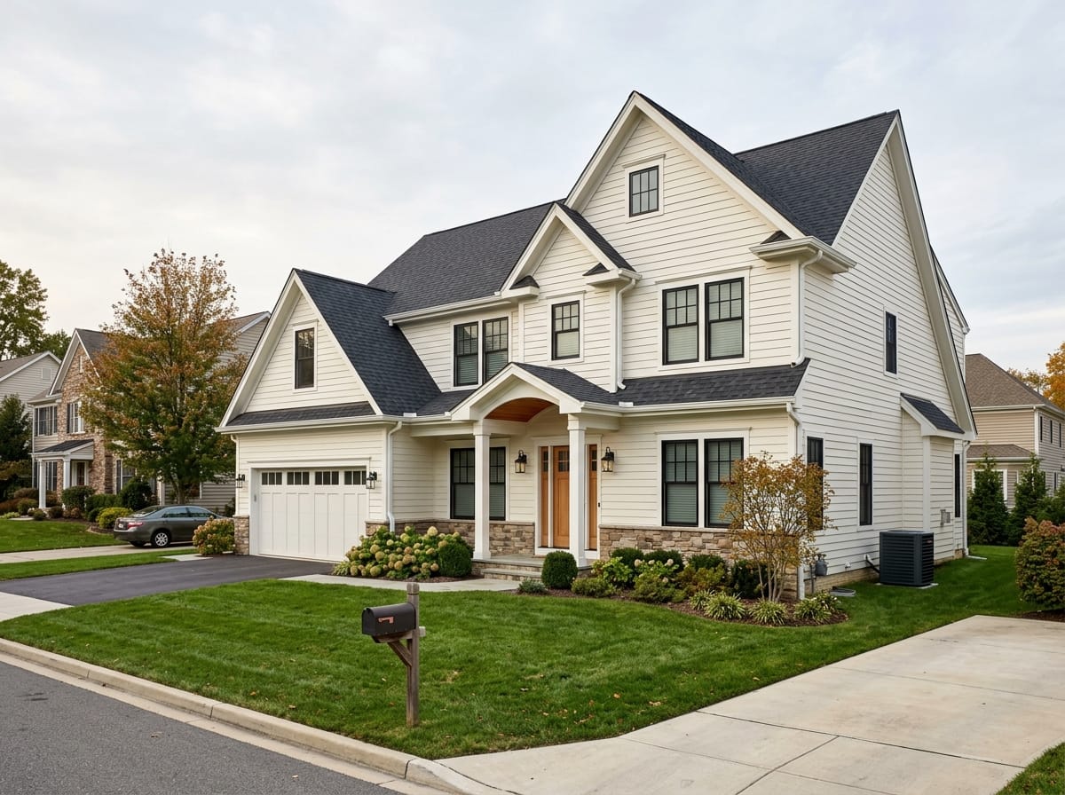
Which one moves first, the roof or the walls
A house that reads as a collection of parts usually got there the same way: somebody chose the wall color and left the roof to cope. The roof cannot cope. It is the second largest block of color on the front of the house, it was chosen years ago by a builder or a previous owner, and it is staying for another decade or two.
So the order is: read the roof, read the brick and stone under it, choose the body color inside what those two allow, and put trim and accent in last. Done that way, most of the shortlist writes itself.
One fork, worth naming now. If the roof is coming off this year anyway, the order reverses - the shingle becomes the flexible choice for one season and gets picked against the masonry. That case has its own section below.
Choosing an exterior color in general - sample patches, light by orientation, what an HOA architectural committee can require - lives on /en/facade-design/exterior-paint-colors. This page is only about the pairing.
Read the undertone of your roof first
American architectural shingles are not one color. Every bundle is a blend of several tones laid down at random, which is what gives a roof depth instead of flatness - and it means the wrapper name tells you little.
In a blend sold as gray you will usually find charcoal granules, pale gray granules, and a third tone doing the real work: brown, violet, green or blue. From the street those average into one impression, and that impression is the undertone your paint has to live with - frequently not the color on the packaging.
- The wrapper name is marketing language, not a color reading
- Three or four tones in one blend is normal on an architectural shingle
- Flat three-tab shingles blend less, so their undertone is harder to hide
The cheapest tool in this process
A sheet of white printer paper held at the roof edge. Against true white a brown shingle looks brown and a blue-gray shingle looks blue, and the question you have been circling answers itself in a minute.
What body colors work with each roof color
Families, not paint codes: every deck mixes its own version of a name, so a code copied out of an article means nothing on your wall. What carries across is temperature and depth.
| Roof | Body colors that work | What fights it | Trim |
|---|---|---|---|
| Weathered wood and driftwood - brown blend with gray flecks | Greige over a warm base, mushroom, soft taupe, cream, muted sage | Cool gray, navy, any white with a blue cast - each turns the roof visibly brown | A warm white one step lighter than the body, repeated everywhere |
| Brown and chestnut - clearly warm | Cream, beige, tan, olive, warm sage, soft clay | Cool gray, blue, violet-based neutrals; a cool white reads as a repair patch | Cream or soft warm white, bronze on the windows |
| Charcoal and near-black | Almost anything light, plus navy, deep green and charcoal if the trim is light | A mid-gray body at the roof's own lightness - the two merge into one smudge | White for contrast or black for a modern read; wood suits both |
| True gray and pewter | Cool and neutral grays, white, pale blue, soft slate, black window frames | Cream, tan, terracotta, yellow-based beige - all look dirty under a cool roof | White or charcoal, picked once and repeated without exception |
| Blue-gray slate | White, pale gray, navy, deep blue-green, gray with a cool base | Beige, tan, warm yellow and most orange-toned brick turn muddy beside it | Crisp white, the one trim color this roof never argues with |
| Green - hunter, moss, or algae-darkened | Cream, warm white, tan, warm soft gray, brown-stained wood | Blue, lavender-based gray, pink-based beige | Cream, or white on a farmhouse read; green trim flattens the house |
| Tan and desert - common across the Southwest | Sand, adobe, cream, sage, muted clay, warm stone tones | Pure cool white, which the sun bleaches to nothing, and any true gray | A deeper warm tone: contrast from depth, not from brightness |
| Terracotta and clay tile | Cream, sand, white with a warm base, olive, soft ochre | Cool gray, pink beige, lavender-based gray, all accidental beside fired clay | Warm white, with iron and wood carrying the accent |
Contrast by lightness, not by color
The rule that catches people who did everything else right. Roof and body can be compatible in temperature and still fail, because they land at the same lightness - and then the house loses its edges and reads as one shapeless mass.
Take the color out of the picture
Photograph the front from across the street and look at it in black and white - the mono filter on a phone, a grayscale export, a page off a laser printer. Lightness is what is being tested.
Look for the line where the wall stops
In the gray version, roof and wall should be obviously different tones with a clear edge between them. If you have to hunt for that edge, the finished house reads as a single flat block.
Mid-gray roof over mid-gray body is the classic tie
The most common failure in the subject, and it happens to careful people, because on samples the two look tastefully coordinated. Coordinated is the problem: related, not equal.
The roof is usually the darker of the two
Dark roof over lighter wall is what nearly every American house is built with. The reverse can be done, but it has to look deliberate - very light roof, very dark body, nothing in between.
Trim is the third step, not a tiebreaker
The trim has to be clearly lighter or clearly darker than both. Trim landing between them does nothing at street distance. Check at dusk too, when low light merges a pair that was only just separated.
Why the gray test is so reliable
From the sidewalk, and more so from a moving car, a house is read as shapes before it is read as colors - and shapes come from lightness. Two beautiful colors at identical lightness look worse than two ordinary ones with a clear step between them.
Metal roofs ask for a stricter palette
A metal roof is a flat, even, uninterrupted color. There is no granule blend to soften a bad pairing and no variation for the eye to forgive, so everything here applies harder. It also has sheen, which asphalt does not.
The cleanest metal option and the least forgiving. The panel is exactly one color, the seams throw regular shadow lines across it, and the same color repeats on ridge cap, flashing and often fascia. Dark bronze, matte black and deep charcoal are the safest partners for painted siding.
- Keep the wall clearly lighter than a dark panel, or clearly darker than a light one
- Seam shadows make a panel read a half step darker than the sample chip did
- A saturated panel dictates the body color for the life of the roof
- Low-gloss sits far better next to flat siding and shows less ripple
When the roof and the brick disagree
The roof is not the only permanent thing in the picture. On most American houses there are four or five, chosen by different people in different decades, which is why they sometimes point opposite ways.
- Take the census first — Roof. Brick or stone, and the mortar with it. Driveway, walkway and front steps, none of them neutral. Gutters, downspouts, drip edge and flashing. Window frames, white or almond on vinyl and not repainted cheaply. The garage door. That is the list your paint has to join.
- Two temperatures is the working limit — Mark each item warm, cool or genuinely neutral. One temperature across the house is calm; two is fine when the split follows something. Three or four is where an elevation looks assembled from leftovers, and no body color rescues it.
- First resolution: take the neutral middle — When the roof is cool and the brick is warm, committing to either side makes the other look wrong. Greige, mushroom and soft taupe exist for exactly this - boring in a fan deck, right on a mixed house.
- Second resolution: go deep enough that temperature stops reading — Past a certain depth the eye stops arguing about warm or cool and simply registers dark. A charcoal or deep green body with light trim sidesteps the conflict, given a simple house shape and a real step in lightness.
- Third resolution: change the small permanent things — Gutters, the garage door, shutters and front steps are all cheaper to change than roof or masonry. Moving gutters to the roof color, or a mismatched garage door back to the body color, often removes the conflict entirely.
Where the full census lives
The fixed materials one by one - masonry and mortar, hardscape, gutters, window frames - are covered on the exterior paint colors page. This one deals only with what to do when two of them point different ways.
Roofline: how much roof the street actually sees
A roofline is the outline the roof draws against the sky - ridge, eaves, gable ends, dormers, and every line where two planes meet. It also covers the roof edge itself, where fascia, drip edge and gutter run. Between them they decide how much roof lands in a street-level view, and therefore how much weight the roof color is carrying.
| Roofline | What lands in a street-level photo | What that means for the pairing |
|---|---|---|
| Low-slope hip on a one-story ranch | A long shallow plane and an eave line running the width of the lot. Above the shrubs it can take close to half of what you see | The shingle is a co-equal color, not a background. Never judge a sample away from the eave |
| Gable ends facing the street on a two-story | Almost no roof surface - wall, a triangle of wall in the gable, a thin edge of shingle at the rake | The body color carries the house. Check the pairing from the side street |
| Steep front-facing gable over the entry | A tall triangle of roof seen close to edge-on, rake board and fascia reading as strong lines | The roof shows up as outline rather than area, so fascia and gutter color outrank the shingle |
| Cape with dormers | One main slope broken by three or four small roofs, dormer faces and cheek walls | Dormer walls in the body color, dormer roofs in the main roof color, or the front becomes a patchwork |
| Complex roof with several intersecting planes | Roof everywhere at two or three pitches, plus valleys and returns. Common from the 1970s onward | The more planes, the more it reads as one mass. Go quieter on the shingle and let the walls carry the interest |
| Deep overhang with exposed rafter tails | A wide band of shadow under the eave, darker than either the roof or the wall | That shadow is effectively a third color, and a dark body goes nearly black under it |
| Flat or low-slope roof behind a parapet | No roof at all from the street - a straight top edge, the coping, nothing above it | The roof color is irrelevant to the front. Coping and fascia do the entire job |
Judge the pair on your own roofline
A combination photographed on a two-story colonial, where hardly any roof is visible, can fall apart on a low ranch where the same shingle fills half the frame. Reference pictures are useful for direction and misleading about proportion.
Four pairings that hold up
Whole schemes rather than colors - roof, body, trim and one accent, with the lightness step built in. The notes say what each one needs in order not to fail.
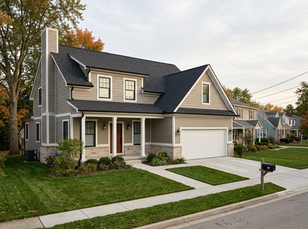
Dark roof, light body
Charcoal or near-black roof over a warm white, greige or pale gray body, white or black trim, wood at the door. The lightness step is enormous, so every edge reads instantly and an imprecise shade barely matters.
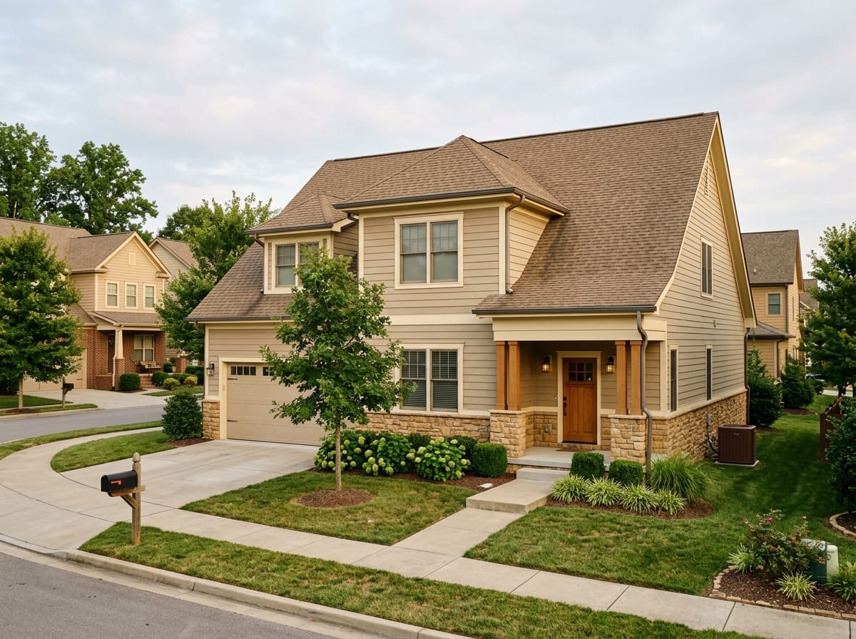
Brown roof, warm monochrome
A brown or weathered wood roof, cream or beige body, trim half a step lighter, stone at the base. Contrast comes from the shadow the trim casts. One fatal move: drop a cool gray in anywhere and it reads as dirt.
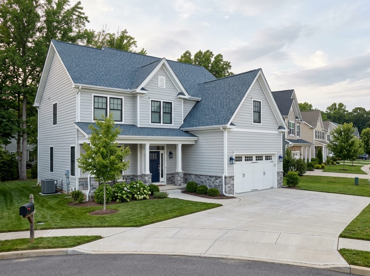
Blue-gray roof, cool scheme
A slate-leaning roof, white or pale gray body, crisp white trim, black window frames, a navy door. This roof has the strongest opinion in the gray family, so the answer is to agree with it. Warm brick makes it hard to land.
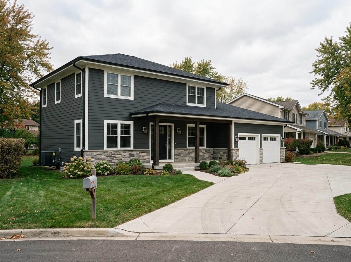
Near-black roof, dark body
Charcoal siding under a near-black roof removes the lightness step the others rely on. What rescues it is white or wood trim drawing the windows, a lighter masonry base, and the sheen difference. Simple shapes only.
House and roof pairings on whole elevations
Model-generated reference frames rather than photographs of finished projects. They show how a pairing reads across a whole front, which is what a color chip cannot tell you.
Charcoal roof over a warm white body
The widest lightness step available, white trim, black windows, wood at the entry. Asks the least of the house shape and reads clearly from a moving car.
Make one like this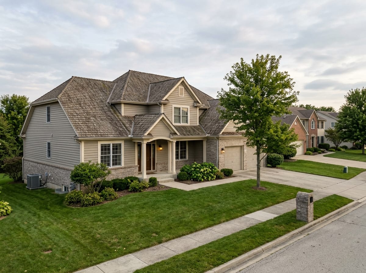
Weathered wood roof over greige
A brown blend above a gray with a warm base, warm white trim, brick at the bottom. The quiet answer for the most common American roof and brick.
Make one like this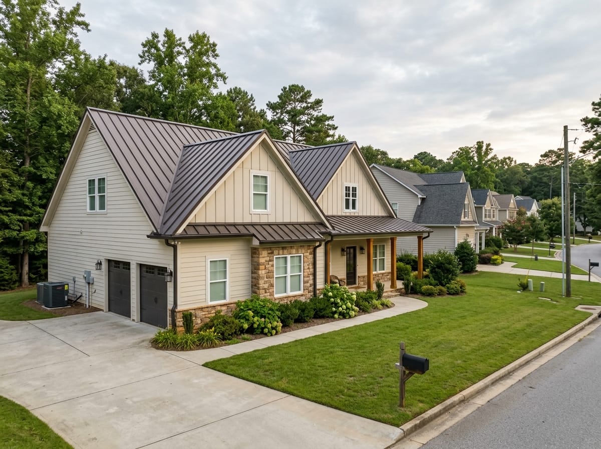
Standing seam in dark bronze
A flat even metal roof with seam shadows, a pale body, stained wood at the porch. No granule blend to hide behind, so the wall color does visible work.
Make one like this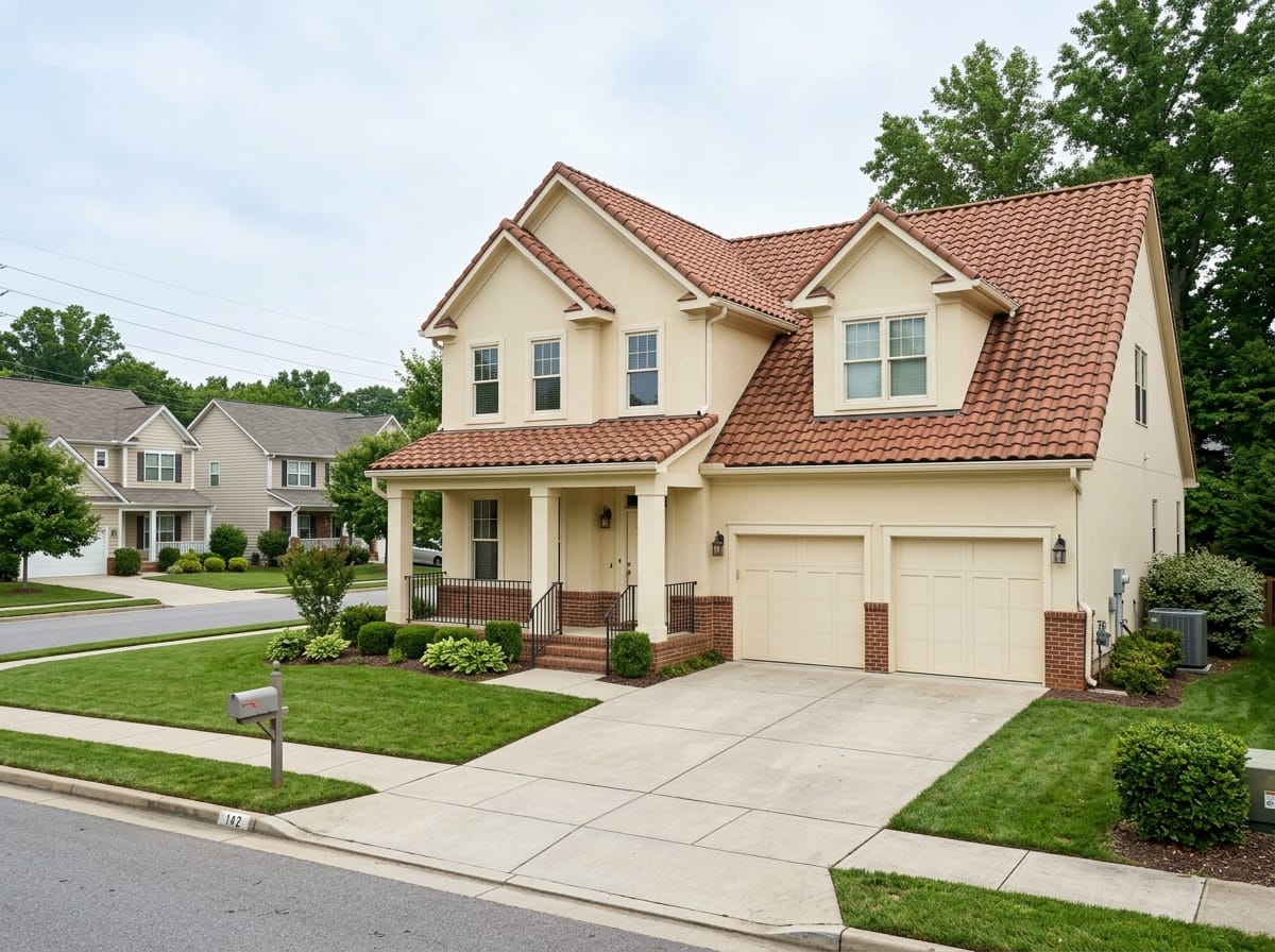
Terracotta tile over cream
Fired clay above a cream body, warm white trim, iron rails, no third paint color. The scheme much of the Southwest and Florida were built with.
Make one like thisDark roofs, heat and cool roofs
Roof color is not only a looks decision in hot parts of the country, and it is worth separating what is solid from what gets oversold.
- A dark surface does run hotter in the sun — Straightforward physics: a near-black roof reaches a much higher surface temperature on a July afternoon than a light one. It is why the question comes up across the Southwest and the Gulf Coast and almost never in the Pacific Northwest.
- How much of that reaches the house is a different question — Between the shingle and the rooms below sit the deck, the attic, the ventilation and the insulation. A vented, properly insulated attic absorbs most of the difference; one that is neither is uncomfortable under any roof color.
- Cool roof is a product category, not a color — Cool-rated shingles, tiles and metal coatings reflect more sunlight and shed heat faster than standard products of the same shade, so some come in darker colors than you would expect. In parts of the Southwest and California this performance is written into local energy code for certain roof types.
- No number on the savings — Any figure for what a lighter roof saves on cooling depends on the attic, the insulation, the ducts and the climate. Quoted without all of that it is a guess, so there are none here.
- In cold and wet regions, other things outrank color — Through the Northeast and Midwest the roof conversation is freeze-thaw, ice dams and ventilation. In the Pacific Northwest it is moss and algae, which also change how the color reads on shaded slopes. Dark streaking shows far more on a light shingle.
How to digitally test a roof and wall color combination
It runs in a browser on a phone or a laptop, and what comes back is your own house redrawn - your roofline, your proportions, your masonry - wearing a different exterior. Signing in is required, and the design tools carry two free generations on the account.
Photograph the house with the roof edge in frame
Stand across the street or at the end of the driveway, in daylight, without strong backlight. Angle slightly so you get the front and one side, which puts a real amount of roof plane in the frame rather than just the eave line. JPG, PNG or WEBP up to 10 MB - HEIC needs converting first.
Pick a style - up to two per run
Ten styles come as tiles: Minimalism, Classic, Scandi, Neoclassical, Loft, Contemporary, Black-tech, High-tech, Chalet, Barnhouse. Each carries its own palette and materials. There is no wishes field and nowhere to name a shade, so you are choosing a direction rather than specifying a color.
Read the result as a pairing, not as a paint order
Look at where the lightness step lands, whether the roof still reads as a separate plane, and how much of it your roofline shows. Download opens immediately: Standard at 1024 px on the long side, Pro at 2048. Run the photo through a second style to hold two pairings side by side.
What the picture settles, and what it does not
It settles proportion and contrast: how much roof your roofline shows, whether a dark body survives next to your roof, where the eye finds the edge. It does not mix paint and cannot be told a shade. Because the style sets the whole palette, a dark-leaning style may come back with the roof restyled as well as the walls - read that frame as an answer to a re-roof question instead. The shade is still settled with patches at the eave.
Try it on the roof you actually have
Every rule above depends on proportion, and proportion is the one thing a photo of somebody else's house cannot give you. Two design runs are free on a new account; signing in is required.
Try it on the roof you actually have
Every rule above depends on proportion, and proportion is the one thing a photo of somebody else's house cannot give you. Two design runs are free on a new account; signing in is required.
When the roof is the thing being replaced
If the tear-off is happening this year, the order reverses for one season: the shingle becomes the choice and the paint the follower. Since the shingle stays for 20-30 years, it is the more consequential decision.
Brick, stone, the chimney and the driveway are still standing after both this roof and the next repaint. They set the temperature, and a shingle that argues with the brick keeps arguing long after the wall color has changed twice. Take the white-sheet reading on the brick and the mortar before you look at a single shingle sample.
- Mortar color often decides a brick wall's temperature more than the brick does
- Concrete and pavers are never neutral - they lean gray, tan or pink with age
- A cool shingle over warm masonry narrows your paint options for two decades
Modern house and roof color combinations
Modern schemes remove the thing that usually rescues a near-miss. With little or no contrasting trim, no mouldings and no shutters, nothing is drawing outlines around windows and corners - the lightness step and the materials carry everything.
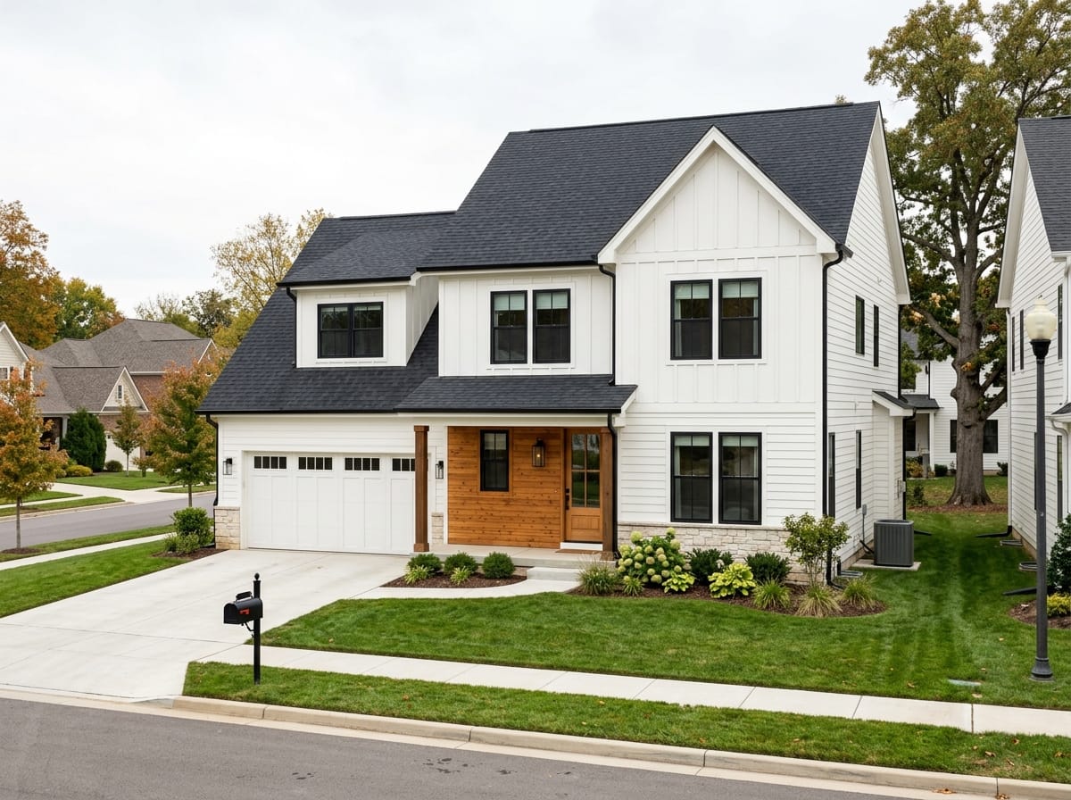
Near-black roof, white or pale body
The most common modern pairing in American new construction: a matte near-black roof, a white or very pale gray wall, black window frames doing the outlining, one warm wood plane at the entry.

Standing seam with a wood accent
Dark bronze or matte black panels above a quiet body, with vertical wood on one volume - a gable end, an entry bay, a garage face. The wood needs to be a whole plane rather than a stripe.
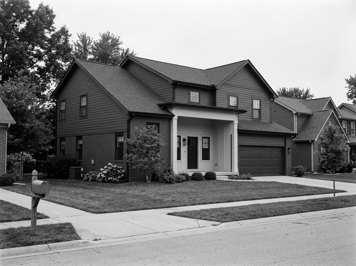
Monochrome with a lighter plane
Charcoal roof, charcoal body, and one element several steps lighter: the entry recess, a projecting volume, the soffit under a deep overhang. The lighter plane is what makes it readable.
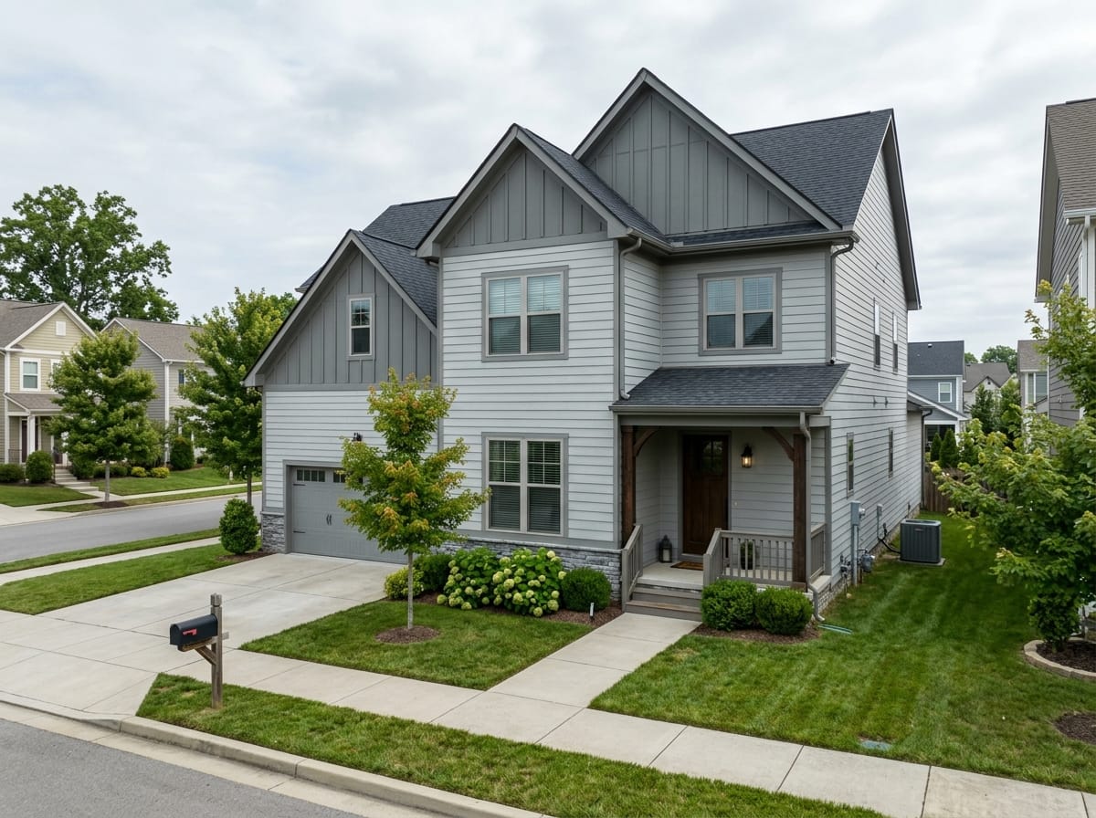
No trim means no safety net
On a traditional house, white casings rescue two colors sitting too close. Strip that away and a tie in lightness has nothing to hide behind, so run the grayscale test harder here than anywhere.
Six ways a roof and wall pairing goes wrong
Almost every house that reads as mismatched from the sidewalk got there through one of these, and all six are free to avoid at the decision stage.
Choosing at the store instead of at the house
The fan deck is read from a foot away under store lighting with no roof in view. The house is read from the street with the roof filling the top of the frame. Every finalist has to be held at the eave.
Trusting the shingle's name over the shingle
A blend sold as gray is very often brown, violet or green once the sun is on it. This one mistake produces more mismatched houses than anything else, because the wrong reading happens before any paint is considered.
Roof and body at the same lightness
Compatible in temperature, identical in value, and the house loses its edges. It looks fine on samples and smudged from the sidewalk. The grayscale test catches it in two minutes.
Matching the body to the roof exactly
The opposite error, and just as visible. Paint and granules never make the same surface, so a wall painted to the shingle's hue reads as matching that did not quite land. Related is the goal; identical is not available.
Four materials in four temperatures
A cool roof, warm brick, a pink-toned driveway and an almond window frame, with a body color trying to please all of them. Something has to be brought into line, and it will not be the roof or the masonry.
Forgetting the garage door and the gutters
The largest flat plane on many front elevations and the longest continuous line across it, routinely left out of the scheme and then noticed forever. Garage door to the body color, gutters to the roof.
House and roof color questions
What is a roof line?
Should the house color match the roof color?
What color house goes with a brown roof?
What color house goes with a gray roof?
What color house goes with a black or charcoal roof?
What color siding goes with a red metal roof?
How do I find the undertone of my shingles?
How do I digitally test a house and roof color combination?
Can I tell it to keep my roof and change only the walls?
Does a dark roof make the house hotter?
Upload a photo of your house
One shot from across the street with the roof edge in frame is enough to see whether a direction sits on your own roofline. Two design runs are free on a new account.
See the pair on my house