70s house exterior makeover - see your house updated
A 1970s house is easy to date from the street: dark stained cedar, orange-toned brick, narrow shutters, a garage standing where the front door should be. Upload a photo and see the same house after the color, the entry and the light fixtures change.
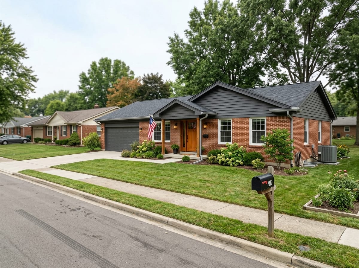
What a 70s exterior makeover actually changes
A makeover on a house from this era is almost never a rebuild. The footprint, the roof pitch, the window openings and the garage all stay where they are. What changes is the surface: color, the entry, the lighting, the trim, and how many different materials are competing on one elevation.
That is why these houses respond so well. They were built solidly and finished busily - brick below, stained boards above, a diagonal accent at the gable, shutters that were never meant to close. Take the noise out and there is usually a calm, low, well-proportioned house sitting underneath.
People search for this as a 70s house exterior makeover, a 70's house exterior, or updating a 1970s house exterior; it is all the same stock of houses. This page stays on those houses - ranches, split-levels, raised ranches, the 1970s two-story - and on seeing the change on your own photo before you commit to a color. How exterior generation works in general lives on the /en/facade-design hub.
How a 1970s house gives itself away from the street
None of these are faults. They are simply the signals that make a passerby put a date on the house before they have looked at anything else.
A long, low silhouette
Ranch, split-level or raised ranch, a shallow roof pitch and wide overhanging eaves. The house reads horizontal from across the street, which is the biggest single difference from anything built after the mid-nineties.
Dark stained cedar or grooved plywood siding
Vertical grooved panels or cedar boards stained walnut brown. Decades of sun later the finish is chalky and uneven, and that color is doing most of the dating.
Diagonal boards at the gable or the entry
A period signature. Some owners love it, some paint it out. It is worth deciding on purpose rather than by default, because it is coming back into favor.
Brick with an orange or salmon undertone
Often only on the lower half, with siding above. That undertone is what fights every cool gray on the paint deck.
Shutters that could never close
Two narrow panels bolted beside a wide window. They read as decoration, and taking them off costs a Saturday and a tube of caulk.
Small windows in thin aluminum frames
A picture window flanked by two narrow openings, single glazing, frames that have gone chalky white or bare mill finish.
A garage that faces the street
Plain steel doors, often the widest thing on the elevation, with no entry strong enough to compete with them.
Wrought iron posts and railings
Thin scrolled columns holding up a narrow overhang above a concrete stoop. Replacing them with posts that have real mass is one of the largest visual changes available.
Aluminum awnings and undersized carriage lights
Scalloped awnings over the windows and the door, plus a pair of small lanterns at the garage. Both come off easily and are rarely missed.
The moves that change the most for the least
Ordered roughly by how much they change the photograph against how hard they are to do. None of them touch the structure.
- Color, applied with discipline — One body color, one trim color, and a third only where the house already has a natural break. The most common real upgrade is not a bolder color, it is fewer colors.
- The front door, treated as one move — The door, its casing, the threshold and the light beside it read as a single object. A new slab inside the old builder casing under a dim fixture still looks like 1974.
- Light fixtures at the right scale — Period lanterns are usually two sizes too small. A fixture roughly a quarter to a third the height of the door reads correctly; at the garage, scale against the door, not against the wall.
- House numbers you can read from the curb — Numbers, mailbox and the path to the door are the cheapest legibility available. Large numerals near the entry, not beside the garage, so the entry is what a visitor looks for.
- Removing what was added — Shutters, awnings, a dead satellite dish, a decorative wagon wheel, a second direction of siding. Subtraction is the only part of a makeover that is close to free.
- Bringing the windows to one tone — Mismatched frames - some white, some bare aluminum, one replaced in brown - read as neglect from the curb. Painting aluminum frames is routine with the right prep. Vinyl is a different conversation: dark colors hold heat, and some manufacturers treat a repaint as the end of their coverage, so ask before anyone sprays.
- Making the gutters disappear — Gutters, downspouts and wall vents painted into the wall or the trim color stop chopping the elevation into pieces. Nobody notices this one consciously, which is the point.
What is expensive, and when it earns it
These are the jobs people assume a makeover requires. Sometimes it does. Often the color and the entry have already done the work.
| The job | Why it comes up | What to weigh first |
|---|---|---|
| Replacing every window | The original units are small, thin-framed and drafty | Worth it for comfort and noise. For looks alone, consistent frame color does a surprising amount. If you are replacing anyway, that is the one moment to change a size. |
| Moving or reorienting the garage | It dominates the front of most houses from this era | Structural, with a new driveway and often a setback question for the city. Treat it as a remodel, not a facelift. |
| A new roof | Old three-tab shingles are the wrong color for everything | Do it on the roof's own schedule. If it is due within a few years, choose the roof color first, because the whole palette gets chosen against it. |
| Painting the brick | Orange brick is the hardest element to design around | In practice this one is permanent. Read the note below before anyone opens a bucket. |
| Adding stone veneer | It reads as an upgrade in catalog photography | Most elevations from this era already carry too many materials. Adding a fifth rarely resolves anything. |
| Building a real porch | A proper entry fixes the front better than anything else | Framing, footings and usually a permit. It is also the one addition that tends to repay the disruption. |
Painted brick does not go back
Stripping paint off brick is slow, costly and can damage the face of the masonry, so plan on the decision being permanent and on a repaint cycle from then on. If the color is the problem, look at mineral stain or limewash, which soak in rather than coat - softer, breathable, and still very hard to reverse. The third option is to stop fighting it and pull the body and trim colors out of the brick itself.
Three directions for the same house
One 1970s ranch supports very different outcomes, and none of them is the correct one. Pick the fork before you pick the color, because the three do not mix well.
The house was designed as a horizontal composition. This direction respects that: you are editing the house, not converting it into something else.
- A deep warm neutral on the body - charcoal, olive, mushroom - with the horizontal lines left intact
- A wood or saturated door, globe or cylinder fixtures, simple flat trim
- Shutters and awnings removed, the original brick kept and used as the source of the palette
- Period details that have come back into fashion - breeze block screens, clerestory windows, exposed beam tails - repaired rather than torn off
Ranch and split-level: making a low house stand up
A house from this era is rarely ugly. It is usually just long and flat with a weak middle. Three ways to give it a center.
Vertical siding across the whole front of a ranch produces a long striped box. Concentrated in one mass, the same material gives the house a face.
- Board and batten on the entry mass alone, stopping at a logical corner
- A taller door unit, or a door with a sidelight, so the opening is not lost in the wall
- Tall narrow planting at the corners instead of one continuous low hedge
The order of work that keeps you from doing it twice
Every decision downstream is made against something upstream. Go in this order and nothing gets chosen twice.
Everything that will not be painted
Roof, brick, stone, and any structural change: the porch, a gable, a wider entry, a new garage opening. These set the constraints for the entire palette, and they are the expensive things to revisit.
Windows and doors, if they are being replaced
Frame colors are fixed at the factory and cannot be revisited later. Black windows on a house whose trim will stay white has to be a decision, not an accident.
Siding: material first, then color
Repaint, restain or replace. If any part of the siding is changing, settle the material before anyone holds up a color card, because the same color reads differently on smooth panel and on rough cedar.
Trim, fascia, soffit and gutters
The second color. This is where the house gets its edges back, and where the gutters either disappear or cut the elevation into strips.
Door, lighting, numbers, railings
The layer everyone notices and nobody budgets for. Do it last, deliberately, with everything above already fixed.
Which of the ten styles suits a house from this era
The exterior tool offers ten style tiles and lets you pick up to two per run. These are the ones that land on this kind of house, and what they tend to do to it.
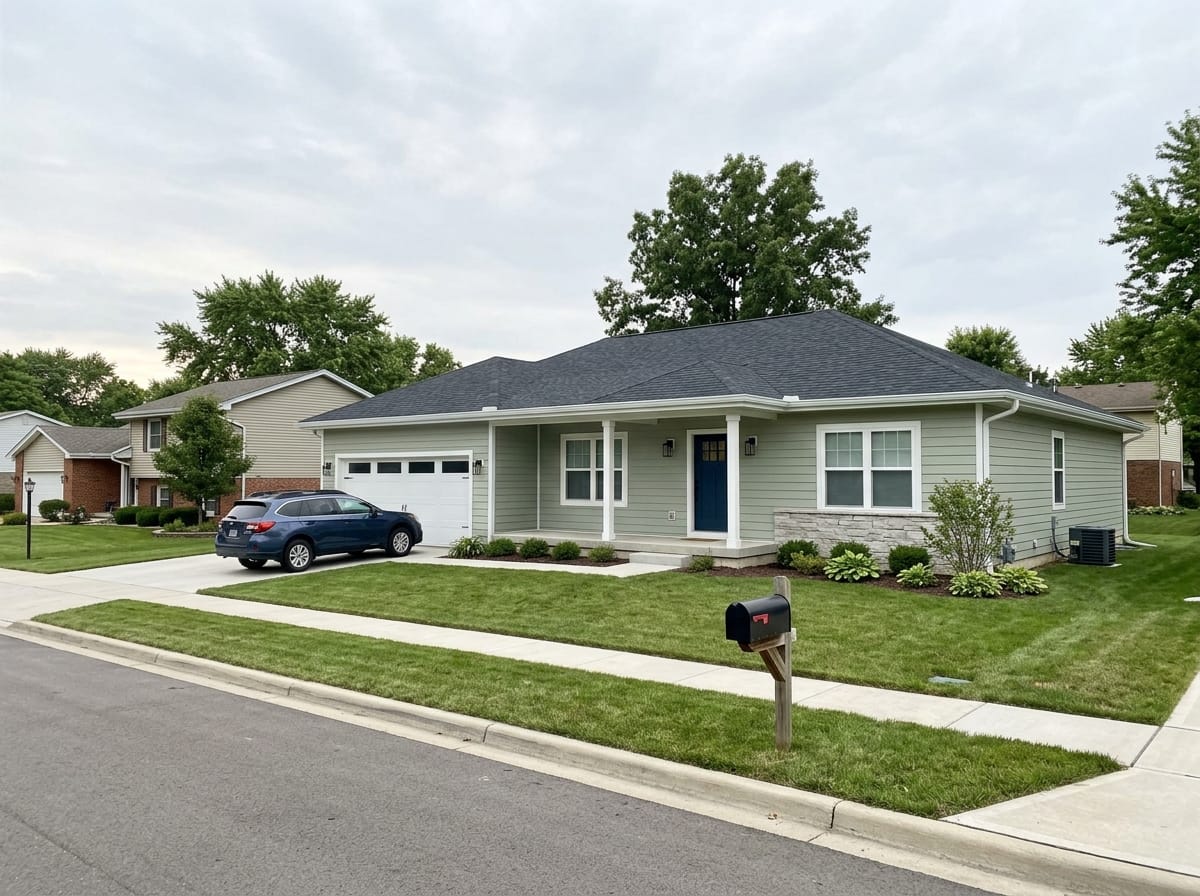
Contemporary
The quiet modern direction: one body color, simplified trim, the horizontal lines kept. The safest first run on a ranch.
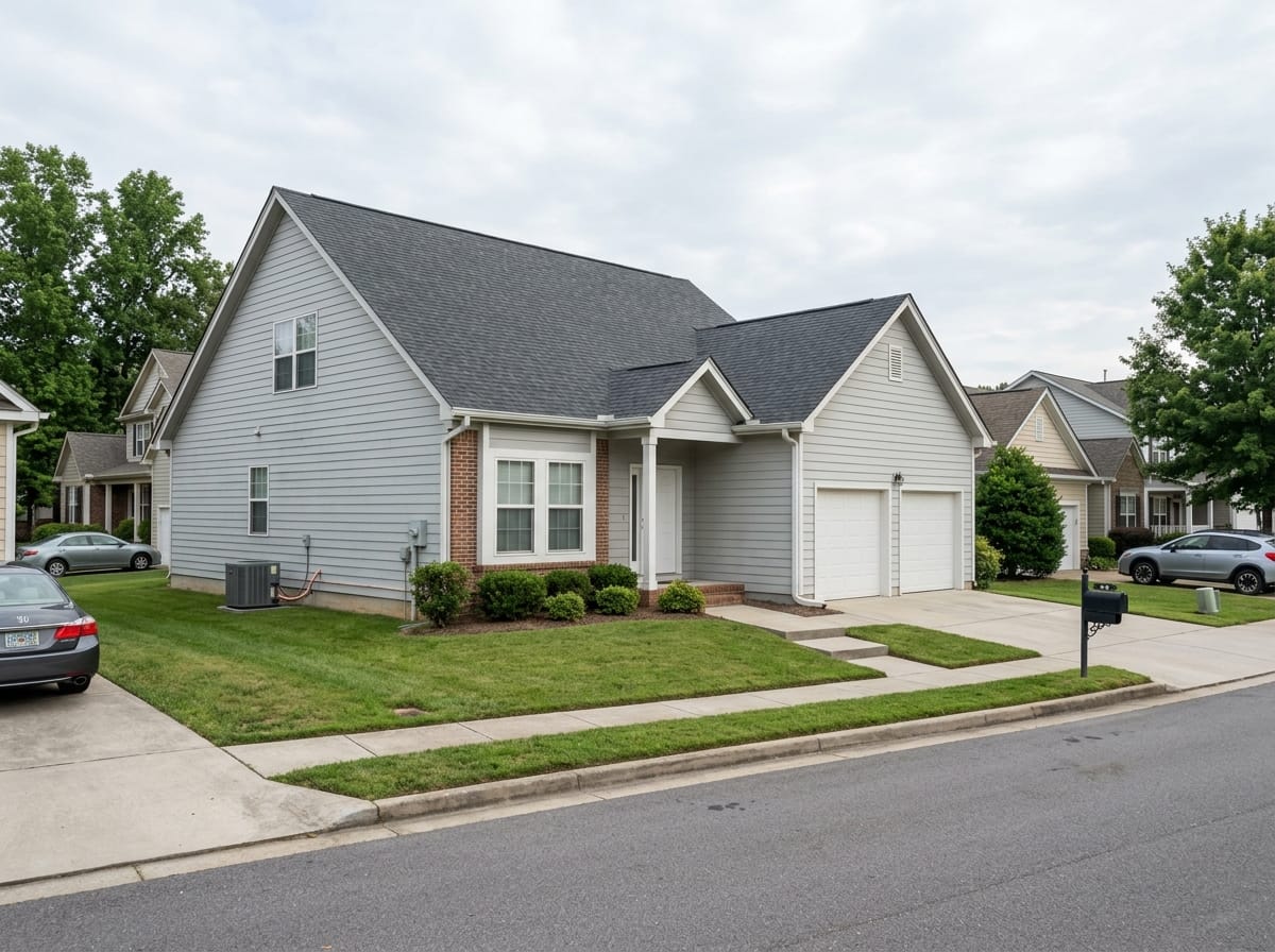
Minimalism
Strips the elevation down hard. Useful for seeing the house with the shutters, awnings and surplus materials gone.
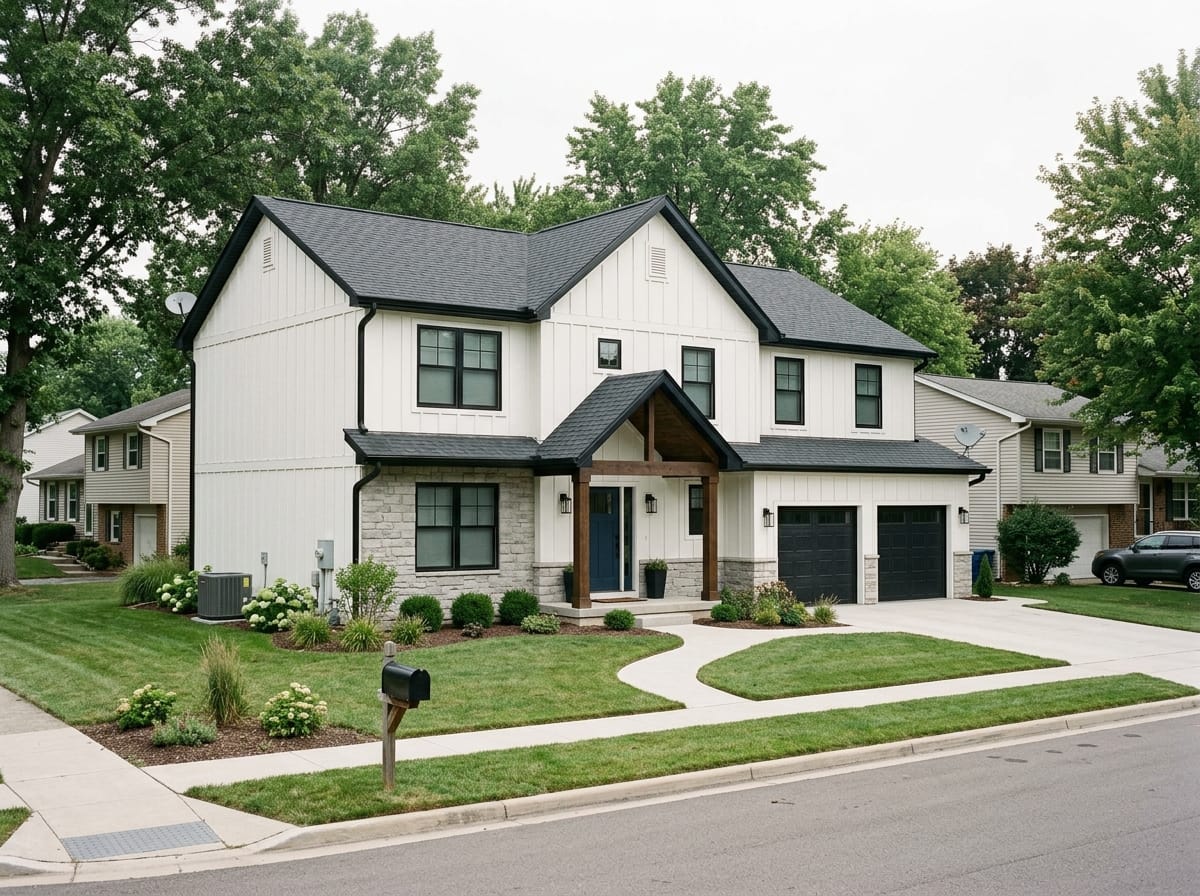
Barnhouse
The closest tile to the modern farmhouse direction - light body, dark trim, vertical boards. Reads better on a split-level than on a long low ranch.
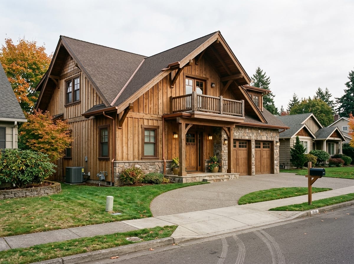
Chalet
Wood-forward and warm. Worth a run if you are keeping the cedar and want to see it revived rather than covered over.
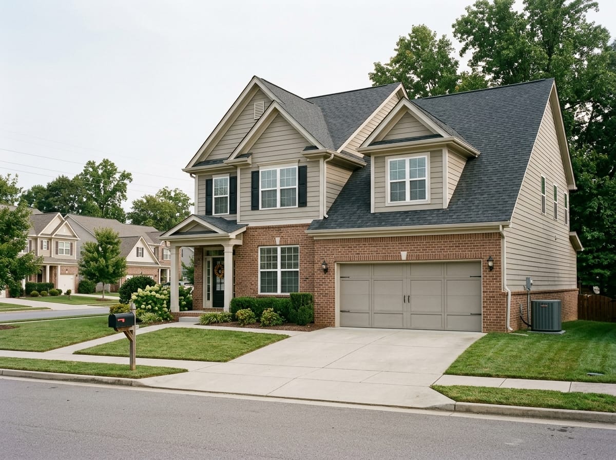
Loft
Leans on brick and dark metal. Useful when the brick is staying and you want it to look deliberate instead of tolerated.
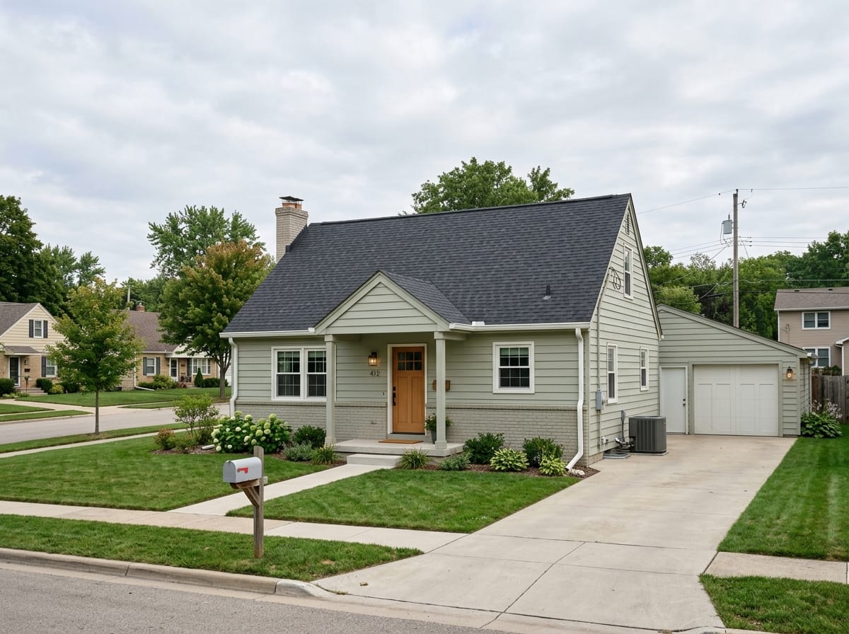
Scandi
Pale, restrained and mid-century adjacent. Often the gentlest version of a light-colored house.
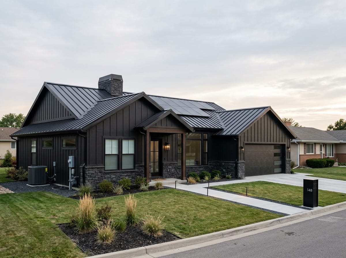
Black-tech and High-tech
Dark and graphic. Striking on a house with a strong roof line, heavy on a low ranch with small windows.
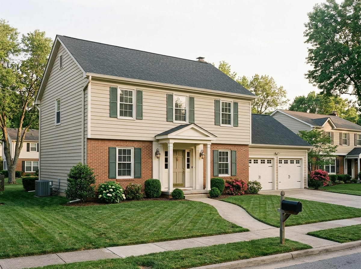
Classic and Neoclassical
The dressier path - symmetry, formal trim, a pronounced entry. Natural on a 1970s colonial, forced on a ranch.
See it on your own house in three steps
It runs in a browser on a laptop or a phone. Sign in first: the design tools keep their free runs on the account.
Photograph the house from across the street
Whole elevation in the frame, garage door closed, cars moved off the driveway, shot straight on or at a light angle. Even light - overcast, or the hour before sunset - beats hard noon sun, which throws half the house into shadow. JPG, PNG or WEBP up to 10 MB; HEIC has to be converted first.
Pick up to two of the ten styles
The tiles are Minimalism, Classic, Scandi, Neoclassical, Loft, Contemporary, Black-tech, High-tech, Chalet and Barnhouse. Two per run, which is exactly what this job wants: two directions on one house, side by side.
Look at the result, then run the other fork
Download opens right away - Standard comes back at 1024 px on the long side, Pro at 2048. Results carry a watermark until a payment has been made on the account.
Reading a before and after without fooling yourself
Half of what makes an after picture feel better has nothing to do with the work. Check these before you fall for your own render, or for anybody else's.
- Same weather, same hour — A gray before and a golden after is a comparison of afternoons, not of paint. If the light changed between the frames, discount most of the improvement.
- The roof — If the roof color moved between the two images, you are looking at a different project with a different budget attached to it.
- The window openings — Count them and check their positions. Wider or taller openings mean framing and new units, not a coat of paint.
- The garage door — The element most often quietly upgraded in an after picture. Decide whether that door is in your plan or not.
- The brick — Painted or not painted is the fork you cannot walk back. Look closely at the after before you let it sell you the direction.
- The landscaping and the sky — Mature planting, fresh mulch and a blue sky do an enormous amount of emotional work for free. Cover the bottom of the image with your hand and judge the house.
- What is actually purchasable — Body color, trim color, door, fixtures, numbers, railings, and the break line between two tones. Those are the parts of the picture somebody can quote and install.
One 70s house, several directions
These are model-generated reference frames rather than photographs of finished projects. Use them to pick a direction, then run your own house.
Ranch, mid-century kept
Charcoal body, warm wood door, the original brick left alone, shutters and awnings gone.
Make one like this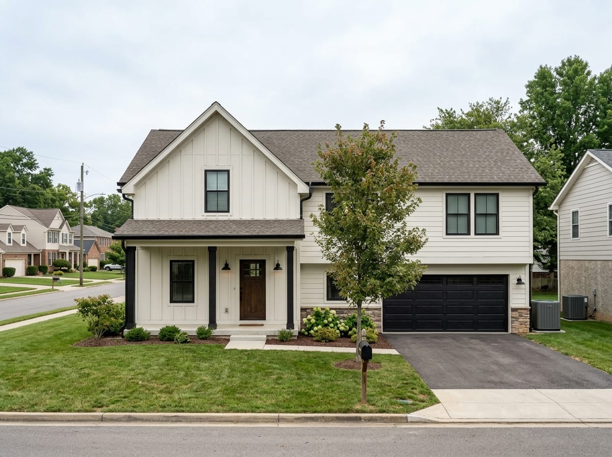
Split-level, farmhouse direction
Light body with board and batten on the entry mass, black trim, a gable over a deeper porch.
Make one like this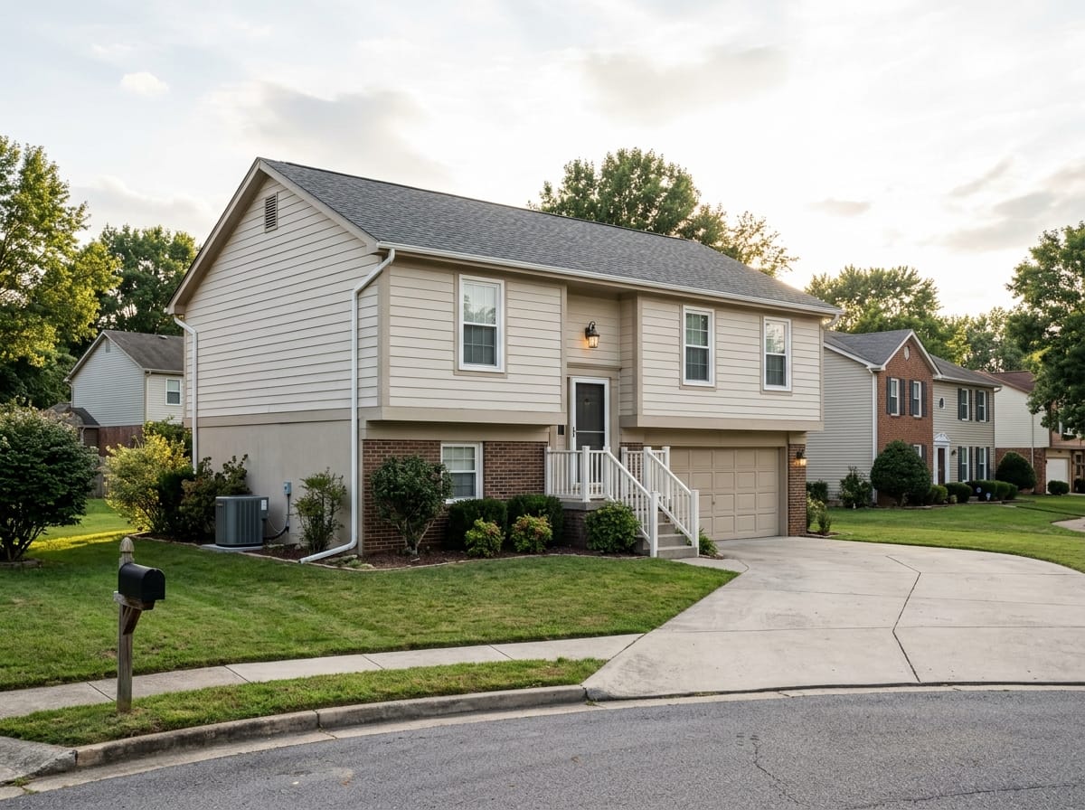
Raised ranch, two tones
Darker lower level under a lighter upper story, one trim color across both, garage door in the trim family.
Make one like this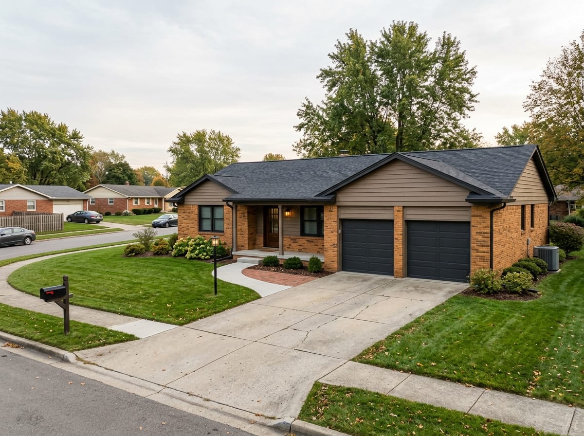
Brick ranch, quiet modern
Palette pulled out of the existing orange brick, simplified trim, a wider entry and flush dark fixtures.
Make one like this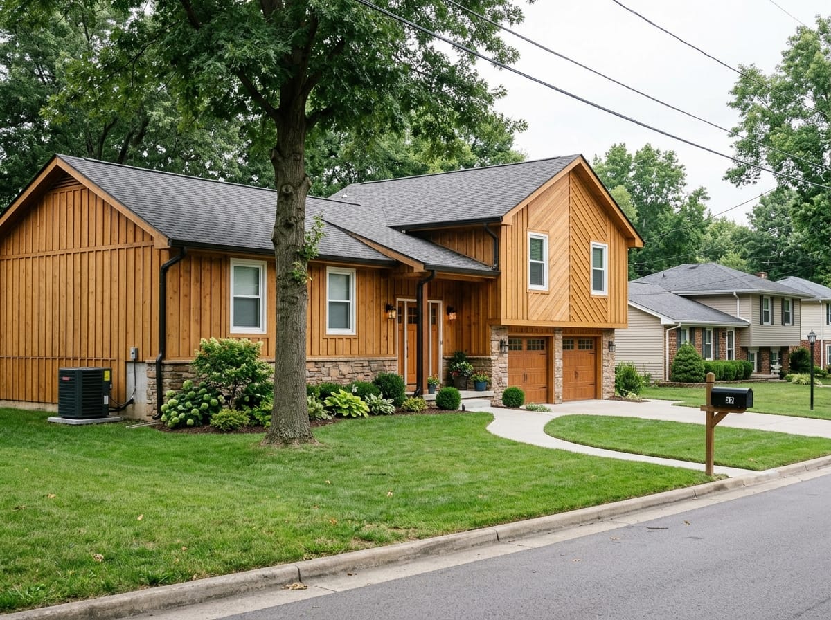
Cedar revived rather than painted
The stained boards restained warm instead of covered, with the diagonal gable accent kept on purpose.
Make one like this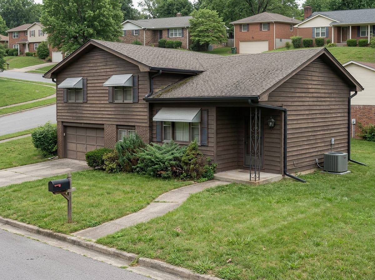
Before: untouched 1974
Dark stain gone chalky, narrow shutters, scrolled iron posts and aluminum awnings over the windows.
Make one like thisTry it on the house you actually own
Reference pictures of other people's houses only take you so far. The directions above look different on a long ranch, on a split-level, and on your particular brick. Two design runs are free on a new account.
Try it on the house you actually own
Reference pictures of other people's houses only take you so far. The directions above look different on a long ranch, on a split-level, and on your particular brick. Two design runs are free on a new account.
What the picture settles, and what it does not
Worth being blunt about this before you start, so the result gets used for what it is good at.
| The question | Does a generated picture answer it? | What to do instead |
|---|---|---|
| Which direction do I want? | Yes - this is the job it does | Run two styles on the same photo and live with both for a few days before deciding |
| Light body or dark body? | Roughly, yes | Confirm with large sample boards on the actual wall, looked at in the morning and in the evening |
| The exact paint color | No | Screens shift color, and a color reads differently on rough siding than on a chip. Take the direction to real samples |
| Remove the shutters, keep the awnings | No - there is no field to ask in | Pick the style, then write the detail list yourself for whoever does the work |
| What will the work cost? | No | A contractor prices from area, condition and materials, never from an image |
| Will the association approve it? | No | Committees review colors, products and drawings. Ask yours what it requires before you order anything |
| Something to build from | No | Structural work needs a licensed professional and, in most places, a permit |
HOA, historic districts and permits
A great deal of 1970s housing sits inside an association with an architectural review committee, and in most of those neighborhoods exterior color, roof material, door style and anything that changes the outline of the house need approval before the work starts rather than after. What a committee wants to see is specific: product lines, color numbers, sometimes a drawing. A generated picture can help you explain an idea, but it is not a submission, and nobody here can tell you how a committee will vote.
Historic overlays are rarer for this era, though some mid-century neighborhoods have picked one up in recent years. Where they exist, the rules usually govern materials and window changes more tightly than they govern color.
Permits are local and cannot be answered from a distance. Paint normally needs none; a porch, a new gable, a widened opening or anything that touches framing normally does. Your building department is the only reliable answer, and it is a short phone call.
Ask before anything is ordered
The cheapest version of this conversation happens before the materials are bought. Take the direction, the product line and two or three candidate colors to the committee in one go rather than one at a time.
Mistakes that make a 70s house look worse
Every one of these turns up on finished houses, and most of them surface only after the ladders come down.
One flat color over everything
A house from this era gets its depth from recesses, soffits, a brick band and deep eaves. Coat all of it in a single flat tone and you erase the articulation the house was designed around.
A modern door on an otherwise untouched house
The door, the casing, the light and the hardware are one move. A sleek slab beside 1974 fixtures and narrow shutters reads as a mismatch, not as an update.
Cool gray over warm brick
Orange and salmon undertones fight the grays that photograph so well elsewhere. Either take the body color out of the brick, or deal with the brick deliberately - not by hoping it recedes.
Tearing out the details that came back
Solid wood doors with a good profile, clerestory windows, breeze block screens, exposed beam tails, a brick with real character. These are the parts other people are now paying to reproduce.
Adding materials instead of removing them
Stone veneer on top of brick under two directions of siding does not read as rich. It reads as unresolved.
Shutters kept and repainted
Two panels that could not cover half the window look worse in a fresh color than in a faded one. Take them off and patch the holes.
Choosing the body color before the roof
If the roof is within a few years of replacement, it is the fixed element in the palette, and the wall color gets chosen against it - not the other way around.
70s exterior makeover questions
Does this work for a 1960s or 1980s house?
Can I show the result to my contractor?
Will my house still look like my house?
How many free tries do I get?
What do I do about a garage that faces the street?
Should I paint the brick?
Can I type what I want changed, such as remove the shutters?
What kind of photo works best?
Will my HOA accept a render?
Do I get drawings or a materials list?
Upload a photo of your 70s house
One photo from across the street is enough to see where the house could go. Two design runs are free on a new account, and the download opens right away.
Show my house updated